Understanding Link Function and Technical Properties
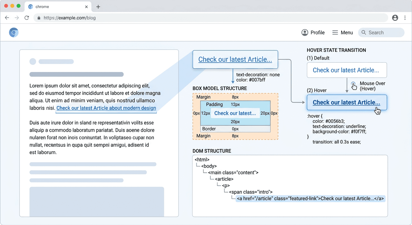
Hyperlinks serve as the fundamental connective tissue of the internet, directing user flow and defining information architecture. Understanding link function requires an examination of how these elements operate within the Document Object Model (DOM) and how they manifest through CSS styling, specifically concerning parameters like link height and interactive states such as link hover and visited link tracking. By mastering these technical properties, developers can ensure higher accessibility and improved user interface predictability.
Quick Summary
A link is a navigation element connecting a source anchor to a destination resource. Its function is governed by HTML semantics and CSS properties that define its appearance and behavior across interaction states. Effective link management relies on clear visual indicators, consistent padding, and standard semantic markup to maintain usability.
- Links utilize the anchor tag to establish connectivity between web resources.
- Interaction states like hover and visited status provide essential feedback for navigation.
- Precise sizing of interactive elements enhances the user experience on touch-sensitive devices.
- CSS styling influences the physical footprint and visual identity of links.
Table of Contents
- The Anatomy of Link Function
- Technical Aspects of Link Height and Sizing
- Managing Link Hover and Interaction States
- The Role of the Visited Link Selector
- Optimizing Link Pattern and Architecture
- FAQ
- Recommended Reads

The Anatomy of Link Function
At its most granular level, a link function is the translation of an HTML <a> element into an actionable navigation target. When a user interacts with this element, the browser initiates a request to the URL defined in the href attribute. The browser's default behavior is to treat these elements as inline-level containers, but this can be modified via CSS to better suit modern design systems. Professionals often utilize tools like link management platforms to consolidate these navigation paths for better tracking and efficiency.
Beyond basic navigation, links are critical for SEO and accessibility. Search engine crawlers traverse these paths to index site content, while screen readers rely on clear anchor text to inform users where a link leads. Semantic integrity depends on using the <a> tag for navigation and reserving buttons for programmatic actions like form submission or component toggling. This distinction is vital for maintaining a predictable experience across disparate user agents.
Technical Aspects of Link Height and Sizing
Link height is a critical property for UI designers, particularly when developing for mobile devices where touch target size is paramount. By default, links are inline elements, meaning their vertical height is restricted by the line-height of the surrounding text. To improve usability, developers often apply display: inline-block or display: block to expand the click area, allowing for defined height and padding values.
Increasing the physical area of a link without bloating the layout requires strategic use of padding. A common mistake is to increase the font-size to force a larger clickable area, which often results in accessibility issues or visual clutter. Instead, setting a consistent minimum target height of 44 pixels for touch interfaces ensures that users can easily activate the link without error. This technical implementation is a pillar of responsive design, as it ensures that the link function performance remains consistent across varying screen densities.
Pro Tip: Always define minimum target areas using padding rather than margins. Padding increases the interactive surface of the element, whereas margins create empty space that is not responsive to pointer events.
Managing Link Hover and Interaction States
The link hover state is one of the most important visual cues in web design. It signals interactivity, confirming to the user that the element is not static text. Effective hover implementation involves subtle transitions—such as color changes, text-decoration toggles, or background shifts—that provide immediate feedback without distracting from the primary content.
When styling the link hover state, it is essential to prioritize accessibility. Contrast ratios must remain high enough that the link remains legible even during the transition. Furthermore, avoid relying solely on color to indicate the hover state, as this can exclude colorblind users. Including a secondary indicator, such as an underline reveal or a transform animation, creates a more inclusive and robust interface.
The Role of the Visited Link Selector
The visited link pseudo-class (:visited) is a specialized tool that informs the user about their history on a website. While modern browsers have significantly restricted the properties that can be modified via this selector—largely to prevent privacy breaches like user history sniffing—it remains a valuable UX feature. By changing the color of an anchor tag after it has been clicked, you help the user navigate complex sites more efficiently by reducing redundant clicks.
Implementation should be subtle. Overly aggressive styling for visited links can lead to "visual noise" that distracts from the hierarchy of the page. Stick to muted tones or slight brightness adjustments that contrast with the active, unvisited link color. This allows users to intuitively understand which paths they have already explored without disrupting the aesthetic flow of the page.
Optimizing Link Pattern and Architecture
Developing a consistent link pattern is necessary for cognitive ease. Users develop an "internal map" of a website based on how links are structured and how they behave. If some links look like buttons and others look like underlined text, the user must expend extra effort to decipher the interface. By establishing a clear design system for your link patterns, you reduce the friction of the navigation experience.
Furthermore, link structure should follow a logical hierarchy. Internal links should be used to provide context and direct the reader to relevant, supplemental information. This not only keeps the user engaged within your domain but also reinforces the authority of your content. Ensure that the anchor text is descriptive; avoid "click here" links, as they provide no context to search engines or users relying on screen readers.
FAQ
What is the difference between link height and line-height? Line-height defines the vertical spacing between lines of text, while link height—when applied to an inline-block element—refers to the total vertical dimension of the clickable region. Adjusting link height is necessary for improving touch targets on mobile devices.
Why does the visited link style not work for all CSS properties?
Browsers strictly limit the :visited selector to prevent privacy attacks where malicious scripts could determine your browsing history by probing the computed style of links. Only a subset of color and border-related properties can be modified.
How can I make links more accessible? Always use meaningful, descriptive anchor text. Additionally, ensure that links have sufficient color contrast against the background and never rely on color as the only indicator of a link, especially during hover or focus states.
What defines an effective link pattern? An effective link pattern is consistent, predictable, and visually distinct from surrounding static content. It should use standard interaction states to provide feedback, ensuring the user is never in doubt about what is clickable.