How to Optimize Every Anchor Link for Better Site Navigation
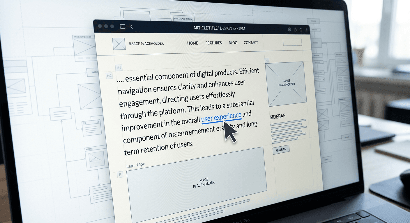
Most site builders treat internal linking as a passive task - highlighting a noun, hitting CTRL+K, and moving on. The misconception is that as long as a word is blue, users will click it. In reality, an unstructured anchor link blending into a paragraph is actively ignored by readers scanning for the exit point of a topic. Without a deliberate strategy for how links look, read, and behave, your site architecture flattens into a wall of un-navigable text. If you want visitors to move from a top-of-funnel blog post to a product page or a creator portfolio, you have to build navigation that users actually recognize as a pathway.
Quick Summary
Optimizing internal navigation requires more than arbitrarily pasting URLs into text. It demands a structured approach to visual design, descriptive formatting, and clear interactive states that guide users efficiently through a website's architecture while signaling relevance to search engines.
- Treat hyperlinks as distinct interactive elements rather than passive text.
- Define the exact purpose of a destination before placing the hyperlink.
- Expand clickable touch areas to meet modern mobile accessibility standards.
- Standardize visual feedback to confirm interactivity without shifting page layouts.
- Write context-heavy text that clearly describes the page it points to.
Table of Contents
- 1. Define the link function before writing the text
- 2. Format the link pattern for visual recognition
- 3. Adjust the link height and clickable area for mobile
- 4. Design the link hover state to confirm interactivity
- 5. Write the descriptive anchor text link
- Common Pitfalls & Troubleshooting
- FAQ
- Recommended Reads
1. Define the link function before writing the text
Where intent dictates the destination
A click alters the user's path. You must determine exactly what the interaction is meant to achieve. Every internal hyperlink serves a specific link function within the broader site architecture. Decide if the link is informational. Does it define a complex term the user does not understand? It might be navigational. This transitions the user to the next logical step in a multi-part tutorial. Or is it transactional? Transactional links push a commercial conversion by directing them to a pricing or signup page.
When you fail to identify this function upfront, you end up placing links arbitrarily wherever a familiar keyword happens to appear. This is a chronic mistake in content management: linking the word "analytics" in a purely educational blog post directly to a high-friction software checkout page, simply because the keyword matched. The paragraph was discussing how to calculate a specific metric, but the link forces the reader onto a sales pitch. The user clicks expecting a formula, hits a paywall, and immediately bounces off the site.
To correct this, map the destination URL directly to the immediate context of the sentence. If the sentence introduces a new concept, the destination must be a definitional resource or a deeper guide. If the sentence mentions a solution you sell, the destination should be your product page. Check your most frequently clicked links today in your analytics dashboard: if a high-traffic link has a high bounce rate on the destination page, you have misaligned the link function with the user's intent.
2. Format the link pattern for visual recognition
Why consistency prevents interaction fatigue
Users do not read web pages linearly; they scan them rapidly for visual breaks and interaction points. If your internal navigation looks identical to bolded text, or uses a color that lacks contrast against the background, visitors will scroll right past it. Establishing a strict link pattern is how you teach the reader what is clickable and what is merely emphasized text.
The mechanism behind this relies on cognitive load and accessibility guidelines. A web user builds a mental model of your site's interface within the first few seconds of a visit. If you use a blue underline in the introduction, a green bold font in the middle, and a red box at the end, the user has to consciously re-evaluate every visual cue. The fatal mistake here is stripping the default underline from inline text for aesthetic reasons while also choosing a low-contrast brand color - like a pale yellow or light gray - for the text itself. The links become invisible to anyone scanning the page or reading with a slight visual impairment.
Fix this by standardizing the CSS design across the entire domain. Choose one high-contrast color specifically reserved for interactive elements, and apply an underline to all inline hyperlinks. If you choose to remove the underline to fit a specific brand aesthetic, you must ensure the color contrast ratio is at least 4.5:1 against the surrounding body text, meeting WCAG accessibility standards. Open your site on a mobile device, turn the brightness down to half, and see if you can still distinguish your links from the regular paragraphs.
3. Adjust the link height and clickable area for mobile
How touch targets define the mobile experience
Mobile navigation fails entirely when the physical reality of a human thumb is ignored in favor of desktop-centric spacing. Clicking a text link with a mouse pointer requires single-pixel precision, but tapping one on a six-inch smartphone screen requires a generous target area. If your text links are densely packed into a single paragraph without adequate vertical spacing, users will frequently trigger the wrong destination.
The underlying mechanics involve the CSS properties of line-height and padding. By default, an inline HTML anchor tag only occupies the exact pixel dimensions of the text characters it contains. The common failure mode is leaving the standard line-height of 1.2 on mobile body copy. When a user tries to tap a link on line three, their thumb overlaps a link on line two. This causes "fat-finger" errors, leading to immediate back-button usage that signals a poor user experience to search engine ranking algorithms.
To correct this, you must explicitly adjust the link height and surrounding touch area in your mobile stylesheet. Set your mobile text line-height to at least 1.6 to create vertical breathing room between clickable elements. Furthermore, ensure that any critical navigational link functioning as a standalone call to action has a minimum touch target size of 44x44 pixels. For inline text, you can achieve a larger clickable zone by adding transparent padding to the CSS of the anchor tag and setting it to display: inline-block, effectively expanding the hit area without visually disrupting the paragraph layout.
4. Design the link hover state to confirm interactivity
Why visual feedback prevents dead clicks
When a user moves their cursor over a navigational element on a desktop device, they expect immediate visual confirmation that the element is active, parsed by the browser, and ready to receive a click. The link hover state serves as this critical micro-interaction, confirming the site's technical responsiveness and building subconscious trust in the interface.
Mechanically, this behavior is controlled by the :hover pseudo-class in your stylesheet. It alters the element's appearance - such as changing the text color, adding an underline, or shifting the background shade - only while the cursor remains positioned over the element. The most prevalent mistake developers make here is designing a hover state that causes the text layout to shift. For instance, adding a bold font weight on hover changes the physical width of the word. This forces the entire paragraph to recalculate and reflow, making the text jump erratically across the screen. This is highly disruptive and makes the site feel broken.
Instead, you must keep the text geometry completely static during interactions.
Practical rule: Only alter colors, text decorations, or background opacities during a hover state; never change font weight, letter spacing, or margins.
A subtle transition, such as fading the link color to a slightly darker shade or removing a default underline upon hover, provides the necessary interactive feedback without breaking the page's structural grid. You can test this today by hovering over a link in your main article body and watching the right margin of the paragraph - if it moves even a single pixel, your hover state needs a rewrite.
5. Write the descriptive anchor text link
How context outranks exact match keywords
The actual words you choose to hyperlink serve a dual purpose: they tell the human user exactly what to expect on the other side, and they tell search engine crawlers how to categorize the destination page. An optimized anchor text link relies on specific, descriptive phrasing rather than generic commands or over-stuffed keyword variations.
The mechanics of anchor text involve the HTML <a> tag enclosing a string of text. Search algorithms weigh this text heavily when determining the relevance of the target page. The classic mistake is using isolated commands like "click here" or "read more." These phrases provide absolutely zero contextual clues. The user has to read the surrounding sentence to guess the destination, and search crawlers discard the link entirely as a relevance signal because "here" is not a topic. The opposite mistake is cramming exact-match SEO keywords into a single hyperlink, which reads as overt spam and alienates the actual human reader.
The fix is descriptive, natural integration into the sentence structure. If you are linking to a guide on consolidating social profiles, do not link the word "here" at the end of the sentence. Instead, hyperlink the phrase "consolidating your social profiles." This integrates seamlessly into the grammar of the paragraph while passing clear, contextual value to both the end user and the crawler mapping your site architecture. Review your recent blog posts today and rewrite any link that forces the user to read the surrounding text just to understand where the click will take them.
Common Pitfalls & Troubleshooting
Internal linking issues often manifest as poor user engagement or declining search visibility. Because these failures look identical from a high-level analytics dashboard - usually presenting as high bounce rates or low time-on-page - diagnosing the exact mechanical flaw in your links is essential. The most common real cause is cannibalization, but you must rule out technical failures first.
1. The Cannibalized Anchor Overlap
- Symptom: You have multiple pages targeting the same topic, and neither is ranking well, despite a heavy internal linking strategy across your domain.
- Diagnosis: You are using the exact same anchor text to link to completely different pages. If you link the phrase "digital business cards" to both a top-level blog post and a lower-level product feature page, you confuse the crawler about which URL is the authoritative resource for that concept.
- Fix: Create a strict internal mapping document. Assign a primary keyword to one specific destination URL, and use long-tail variations or surrounding context when linking to secondary, related pages.
2. The Invisible JavaScript Link
- Symptom: Users can click your navigational elements without issue, but search engine crawlers are not following the links, leaving deep pages unindexed and orphaned.
- Diagnosis: The links are coded using JavaScript
onclickevents rather than standard HTML<a>tags withhrefattributes. Crawlers generally do not execute arbitrary click events to discover URLs. This frequently breaks navigation on custom-built single-page applications. - Fix: Rewrite the interaction at the code level. Even if JavaScript handles the routing visually, the element must contain a standard
hrefpointing to a valid URL string so crawlers can parse the destination statically.
3. The Orphaned Text Block
- Symptom: A lengthy, in-depth page has a high exit rate specifically in the middle sections, long before the user reaches the conclusion or the primary call-to-action.
- Diagnosis: You have gone too long without providing a relevant exit node. If a user loses interest in the current topic but sees no immediate, contextual link to jump to a related topic, they simply close the browser tab.
- Fix: Audit your content chunks. Ensure that every 300 to 400 words contains at least one highly relevant internal link that offers a lateral move to another piece of content, keeping the user inside your ecosystem.
4. The Bare URL Paste
- Symptom: The content features raw links (e.g.,
https://example.com/page-name) directly pasted into the paragraph text. - Diagnosis: The writer bypassed anchor text formatting entirely. Raw URLs are aesthetically jarring, completely inaccessible to screen readers (which will read every single character aloud to visually impaired users), and look highly unprofessional.
- Fix: Wrap every raw URL in descriptive text. If you must display a bare URL for a print-friendly document, strip the
https://protocol and use a clean, visually simple path, but always hyperlink the actual text in the digital version.
FAQ
How many internal links should I place in a single article? There is no strict numerical limit, but usability should dictate the volume. Place a link whenever it genuinely provides helpful context, defines a term, or offers a logical next step. Packing paragraphs with dense blue text creates visual clutter, increases cognitive load, and dilutes the value of each individual link for the reader.
Should internal links open in a new tab? No. Standard navigational behavior dictates that internal links should open in the same tab, allowing users to rely on their browser's native "Back" button. Forcing new tabs for internal navigation clutters the user's workspace, breaks their established browsing flow, and creates confusion on mobile devices where tab management is cumbersome.
Does the position of a link on the page matter? Yes. Links placed higher up in the body content - especially within the first few paragraphs - carry more weight for both user engagement and search engine crawling. Links buried in footers, sidebars, or the final paragraph are often treated as boilerplate navigation rather than strong contextual signals.
Can I use an image as an internal link? Yes, but you must optimize it differently than text. When an image serves as a link, the image's "alt" attribute functions as the anchor text. If you leave the alt text blank, you are essentially creating an anchor link with no descriptive text, which strips away the context search engines need to understand the destination page.