Building a High-Converting Portfolio Link: A Step-by-Step Guide
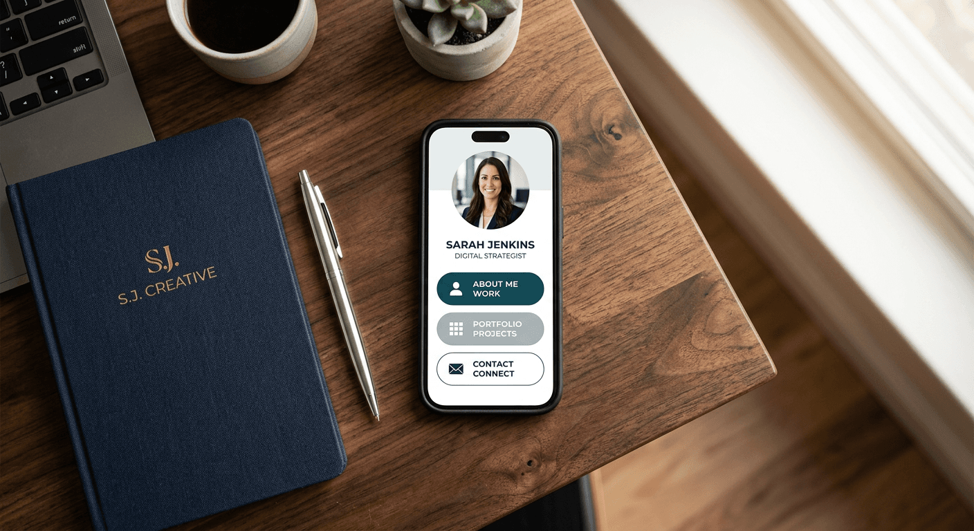
Most freelancers and creators assume that proving their professional expertise requires sending prospective clients to a heavy, multi-page website. They spend weeks designing complex navigation menus and optimizing desktop image load times, only to watch their analytics drop off before a visitor ever clicks the "Work" tab. The reality of modern client acquisition is much faster: decision-makers evaluate a portfolio link on a mobile screen in a matter of seconds. If they have to hunt for your best case study, navigate a nested dropdown menu, or figure out how to copy a plain-text email address to contact you, they will simply leave.
Building a centralized digital presence is about removing friction. A single, well-structured mobile landing page forces you to distill your career into its most potent elements, serving high-intent visitors exactly what they need to evaluate your expertise and hire you.
Quick Summary
A portfolio link is a single, centralized digital landing page that consolidates your professional work, case studies, and contact methods into one mobile-optimized interface. It replaces scattered email attachments and slow-loading traditional websites by offering a streamlined route from discovery to inquiry.
- Limit your showcased work to your three most relevant, recent case studies.
- Host heavy media files externally to preserve the page's mobile load speed.
- Embed direct intake forms to remove friction from the hiring process.
- Track visitor click-through rates to identify which pieces of work drive the highest conversions.
Table of Contents
- 1. Defining the Core Purpose and Audience
- 2. Curating the Core Project Link
- 3. Structuring the Assets Link for Easy Access
- 4. Setting Up the Link Contact Interface
- 5. Designing and Publishing to Create Link Authority
- Common Pitfalls & Troubleshooting
- FAQ
1. Defining the Core Purpose and Audience
Before you select colors or write button copy, you must define the exact mechanism of your page. A generic landing page speaks to no one and fails to convert because it attempts to serve too many masters.
The mechanics of this step involve mapping out the primary intent of the visitors who will click your URL. Traffic arriving from a professional network like LinkedIn has a different temperature and intent than traffic arriving from a visual platform like Instagram or TikTok. If your primary audience consists of creative directors looking to hire an illustrator, your page must prioritize visual proof immediately. If your audience is technical recruiters looking for a software engineer, the page must prioritize GitHub repositories and documentation samples.
The most common failure mode at this stage is the chronological dump. Practitioners often treat their digital presence as an exhaustive archive of their entire career, listing every project they have touched since graduation. The result is cognitive overload for the visitor, who is forced to sift through outdated or irrelevant work to find proof of your current capabilities.
Instead, define the single primary action you want a visitor to take. Are you driving them to book a discovery call? Download a rate card? Purchase a digital product? Every element you place on the page must serve that specific conversion goal. If an outbound button does not actively push the visitor toward that primary action, it is a distraction that will dilute your click-through rate.
2. Curating the Core Project Link
When a prospective client evaluates your work, they are assessing your problem-solving process, not just the final aesthetic deliverable. A naked image or a disconnected URL provides no context about the constraints you faced, the timeline you managed, or the return on investment you generated for the previous client.
To build this section properly, you must carefully select two or three definitive case studies. For each piece of work, write a focused summary using the Problem-Intervention-Result framework. Explain what the client needed, the specific technical or creative actions you took, and the measurable outcome of that work. Instead of sending a messy folder of screenshots, you provide a single project link that directs the visitor to a structured, static case study.
The mistake people consistently make here is linking directly to live client websites as proof of their work. Live websites change. A client might update the copy, alter the design, or let the domain expire entirely. If you send a warm lead to a broken or modified live site, your credibility vanishes instantly.
Practical rule: Never link out to a live client website or application as primary proof of your work; always route visitors to a static, controlled case study where you dictate the narrative.
Limit your showcase strictly to the kind of work you want to be hired for next. If you are pivoting away from brand design into product design, remove all brand design projects from the interface. Leaving legacy work on your page out of nostalgia only signals to prospective clients that your focus is split.
3. Structuring the Assets Link for Easy Access
Modern digital portfolios often require sharing heavy files: high-resolution video reels, extensive code repositories, or large PDF whitepapers. The mechanical challenge is that embedding these files natively onto a mobile landing page destroys its load speed. Mobile browsers will choke on embedded 4K video, causing the page to stall. When a page takes longer than three seconds to render, bounce rates spike exponentially.
The solution is utilizing external cloud infrastructure. You need to route them to a dedicated assets link hosted on a platform built specifically for heavy media delivery, such as a managed cloud drive or a Content Delivery Network (CDN). This keeps your primary landing page completely weightless.
A frequent error practitioners make is forcing visitors to download massive files directly to their local devices without warning. A client reviewing your credentials on a cellular connection will aggressively abandon the page if an unexpected 50MB PDF begins downloading.
To structure this correctly, clearly label the destination and the file format. A button reading "View 2025 Video Reel (YouTube)" manages expectations far better than a button that simply says "Watch Now." If you are sharing proprietary information or work under a non-disclosure agreement (NDA), ensure that the external storage location is password-protected, and securely provide that password only to vetted leads during the consultation phase.
4. Setting Up the Link Contact Interface
Generating interest is useless if the visitor cannot easily initiate a conversation. The conversion mechanism of your page is its contact interface, and it must operate seamlessly across all devices.
The standard approach of listing a plain-text email address is fundamentally broken. It forces the user to manually copy the text, exit the browser, open their email client, paste the address, and draft a message from scratch. Every step in that sequence is a point of friction where a lead can be lost. Furthermore, scraping bots routinely harvest plain-text emails, filling your inbox with automated spam.
Instead, setting up a primary link contact method involves integrating a direct intake form or a calendar booking embed. An intake form pre-qualifies the lead by asking specific, mandatory questions: the project timeline, the allocated budget range, and the core objective. This prevents you from wasting hours on discovery calls with clients who cannot afford your baseline rates.
For established practitioners handling multiple types of traffic, you must separate new business from administrative queries. If you run a high-volume freelance operation, mixing urgent client communications with cold lead inquiries creates operational chaos. You should build a separate route for a link customer service desk or a client portal login, keeping your main intake funnel strictly reserved for lead generation. This dedicated routing ensures that paying clients receive immediate attention without clogging your sales pipeline.
5. Designing and Publishing to Create Link Authority
The infrastructure you choose when you create link destinations dictates the reliability and perceived authority of your digital presence. A default, randomly generated URL string looks temporary and unprofessional to corporate decision-makers. Trust is established through consistent branding, custom domains, and reliable hosting uptime.
When evaluating platforms, you are looking for an ecosystem that handles mobile responsiveness, SSL security, and traffic analytics without requiring you to manage backend server configurations. For instance, using HeyLink.me - One Link for Everything allows creators and businesses to consolidate their online footprint. By utilizing a platform that provides custom domain mapping and deep link analytics natively, users can bypass the traditional costs associated with separate website hosting, analytics tools, and landing page builders.
The most damaging mistake made at the publishing stage is changing your core URL handle months after establishing it. If you print QR codes on physical assets or embed a specific URL across dozens of social media profiles, changing that handle later breaks all existing routing. Link rot actively destroys the network you have built.
Before publishing, establish a permanent handle that aligns with your registered business name or personal brand. Connect your tracking pixels and analytics tools immediately. You need to measure the Click-Through Rate (CTR) of your primary buttons, not just top-level page views. If you have 1,000 views but only two clicks on your booking form, the data indicates that your offer is unclear or your button placement is invisible on mobile screens.
Common Pitfalls & Troubleshooting
Even with a strategic setup, specific operational failures can suppress your conversion rates. These failures often present identical symptoms - a lack of client inquiries - but require entirely different technical interventions.
Analytics Black Holes
Symptom: Your social media metrics show high outbound click volume, and your landing page shows high unique visitor counts, but you record zero clicks on your actual portfolio items or contact forms. Fix: Your call-to-action (CTA) hierarchy is broken. The most common cause is that interactive buttons are visually indistinguishable from static headers. Visitors do not realize they can click the elements. Redesign your primary buttons using high-contrast background colors, and rewrite the labels to start with strong verbs (e.g., "Read the Case Study" instead of "Project Overview").
Overloaded Choice Architecture
Symptom: Analytics reveal that visitors are opening the page but bouncing (leaving without clicking anything else) in under three seconds. Fix: You have induced decision fatigue by presenting too many outbound options. A page with fifteen different buttons, ranging from social profiles to old blog posts to minor side projects, overwhelms the user. Audit your page immediately and aggressively prune the options. Reduce the total number of outbound routes to a maximum of five core destinations, ensuring the most important conversion mechanism sits at the very top of the mobile screen.
Broken In-App Rendering
Symptom: The page looks flawless when you test it on a desktop browser or a native mobile browser like Safari, but client leads report that the formatting is broken or buttons are overlapping. Fix: The page is failing inside the constrained in-app browsers used by platforms like Instagram, TikTok, or LinkedIn. These proprietary browsers often strip complex CSS or fail to execute heavy JavaScript animations. The fix is to remove all custom CSS animations, eliminate floating video backgrounds, and rely strictly on the native layout blocks provided by your link-in-bio platform, which are pre-tested against in-app browser constraints.
Silent Link Rot
Symptom: A previously high-performing button suddenly stops generating traffic entirely, despite consistent page views. Fix: The destination URL has changed or the third-party service is down. This happens frequently when linking to external calendar tools or cloud drive folders where the sharing permissions have accidentally expired. Conduct a manual audit of every outbound route on your page while logged out of all your accounts. Replace any dead URLs and ensure cloud drive links are set to "Anyone with the link can view."
FAQ
How many projects should I showcase to a prospective client?
Limit your showcase to a maximum of three highly detailed case studies. Clients do not have the time to review an exhaustive archive. Three deep dives demonstrating clear problem-solving and measurable results provide significantly more proof of competence than ten shallow images.
Should I display my pricing publicly on this page?
The decision depends entirely on your operational model. If you offer standardized, productized services with fixed scopes, displaying pricing publicly acts as a powerful filter, eliminating leads who cannot afford your baseline. If you offer custom consulting where the scope varies wildly per client, withhold pricing until after you have conducted a detailed discovery call.
Is it necessary to connect a custom domain?
Yes. While a free, default URL is sufficient for testing, operating under a custom domain signals longevity and professionalism. It proves to enterprise clients and corporate decision-makers that you are a legitimate business entity investing in your own infrastructure, rather than a hobbyist.
What is the most critical metric to monitor in the analytics dashboard?
The click-through rate (CTR) on your primary conversion button. Top-level page views only tell you that your external marketing is working. The CTR of your specific intake form or booking calendar tells you whether the page itself is actually convincing visitors to take action.